The new Japan Airlines design takes inspiration from JAL’s logo the tsurumaru or crane circle. A red folded paper crane symbolises prayer, peace and the spirit of hospitality.


Nendos new designs will be used on all amenities throughout all cabin classes and will be used on everything from blankets, napkins, table cloths, cardigans, eye masks, slippers and more.


Nendo has cleverly incorporated the paper cranes design into the product design, flat and rectangular objects, such as napkins, tablecloths and blankets feature folded corners emulating the cranes head. The pattern used for folding the paper crane is also used as a design element on menu cards and pouches—the folds and colours differing to enable cabin crew to identify menus from different routes or flights. The design idea is to have similar patterns applied to tray mats and tableware on domestic flights, with visual lines from the folding pattern, revealed when stacked while still depicting change through changing menus.


With items being made in different regions and countries, it was decided that colour matching one colour grey could be problematic, so instead, Nendo came up with seven very distinct greys to be combined in appropriate places and mediums.
First-class is assigned a warm and calming grey. Business-class a light and a dark grey to give a modern feel. Three light grey tones are assigned to economy class. A neutral grey to fit seamlessly into any class was used in the packaging for masks, earplugs, tissues, toothbrushes, and other consumables. Rather than choosing a single colour as before, four colours are integrated and varied in advance to avoid the risk of inconsistent colour during manufacturing.
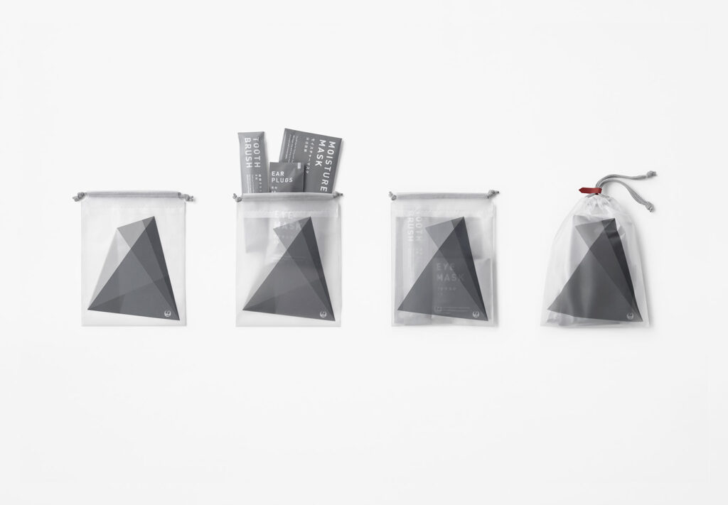


Textual elements are displayed as clearly and large as possible on each package in three languages: English, Japanese, and Chinese.
Packaging openings and the direction to tear are unified with triangular and dotted line elements.